Magnifi: The Future of Investing Starts Here
Overview
A way to smart investing
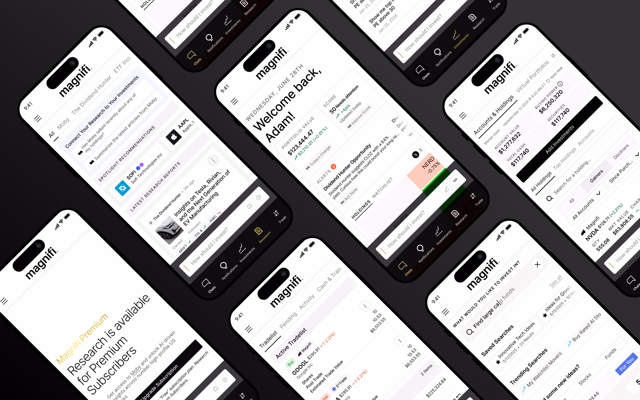
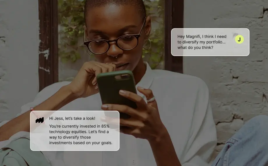
Magnifi is a conversational wealth management platform that helps users make informed investing decisions through automation, intelligent recommendations, and guided exploration. When I joined, the product was functional but lacked a cohesive visual system, scalable layout structure, and intuitive navigation model.
My primary responsibility, alongside my team, was to redesign the product experience and introduce new analytical features to improve conversational experience, decision‑making, and engagement.
The Challenge
What wasn't working
Magnifi had powerful investing tools, but the experience made users work to connect them.
- Rist Analysis: Portfolio data was difficult to interpret, making it hard for investors to understand the overall risk of their portfolio.
- Performance: Investors had no quick way to tell whether they were outperforming or falling behind the market.
- Decision Making: Important market updates and portfolio insights were buried within the product instead of being surfaced where users made investment decisions.
- Navigation: The experience relied too heavily on AI prompts. Users had to ask the assistant to complete routine tasks they expected to do directly.
The redesign focused on bringing these pieces together so users could understand their portfolio faster and make decisions with more confidence.
Contribution
My role
I led the re-design of Magnifi’s core product, focusing on how investment information is structured and understood, while contributing to new analytical features like performance comparisons and portfolio health indicators.
I worked closely with product managers, engineers, and financial experts from early concept through high-fidelity designs. The redesigned experience has since been rolled out as part of Magnifi’s evolving product.
Kickoff
Understanding investor expectations
Three questions shaped the direction of the work.
- How can the product help users understand their portfolio health easily?
- What information needs to be visible upfront for users to feel oriented and confident?
- What does a truly clear investing experience look like?
Every design decision was guided by one goal: helping investors maximize their wealth.
Challenge 1
Making important information easier to find
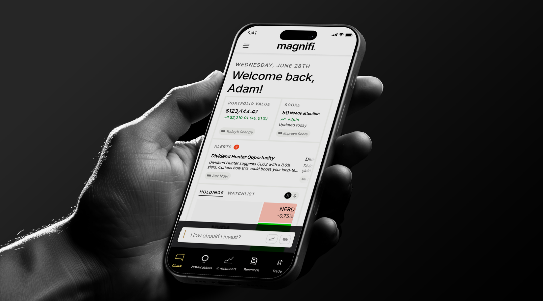
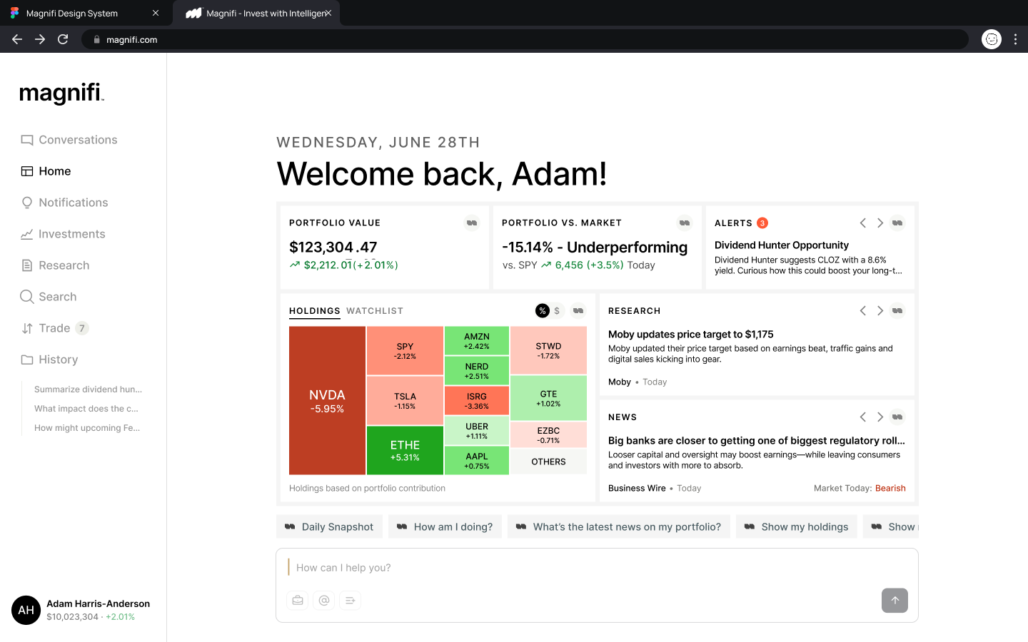
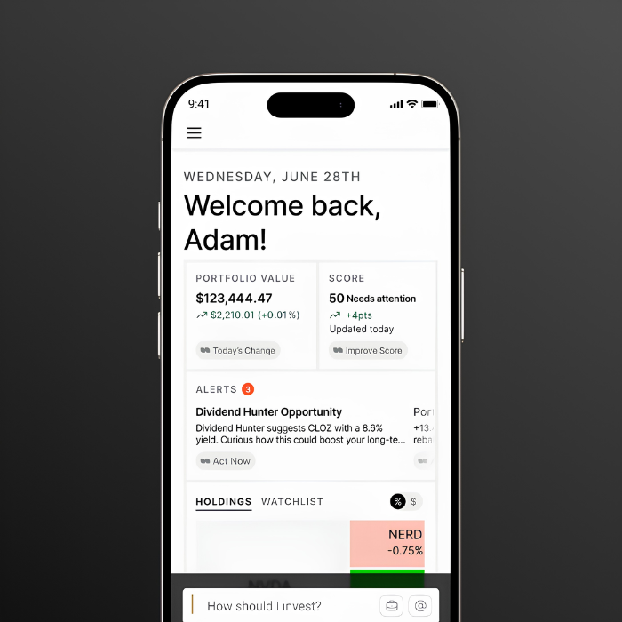
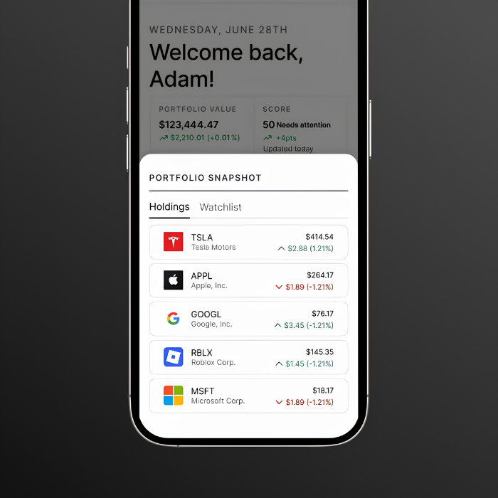
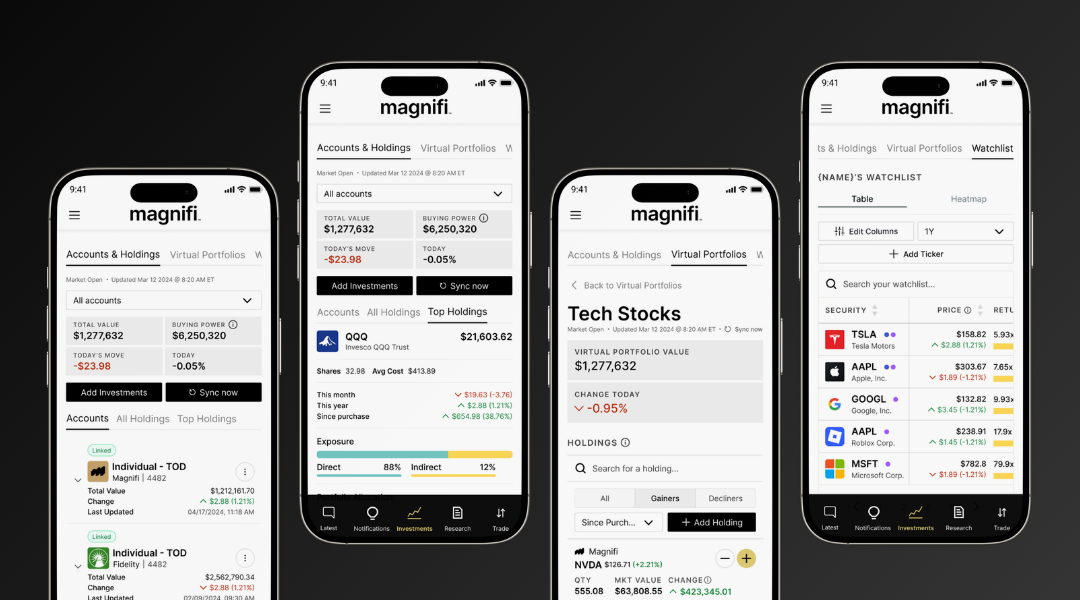
The original dashboard showed a lot but lacked focus, hiding what mattered and feeling dense. The redesign introduced a clear hierarchy, surfacing portfolio value, performance, and alerts upfront, making insights easier to read and understand.
 Before
After
Before
After
Challenge 2
Helping investors navigate their portfolio
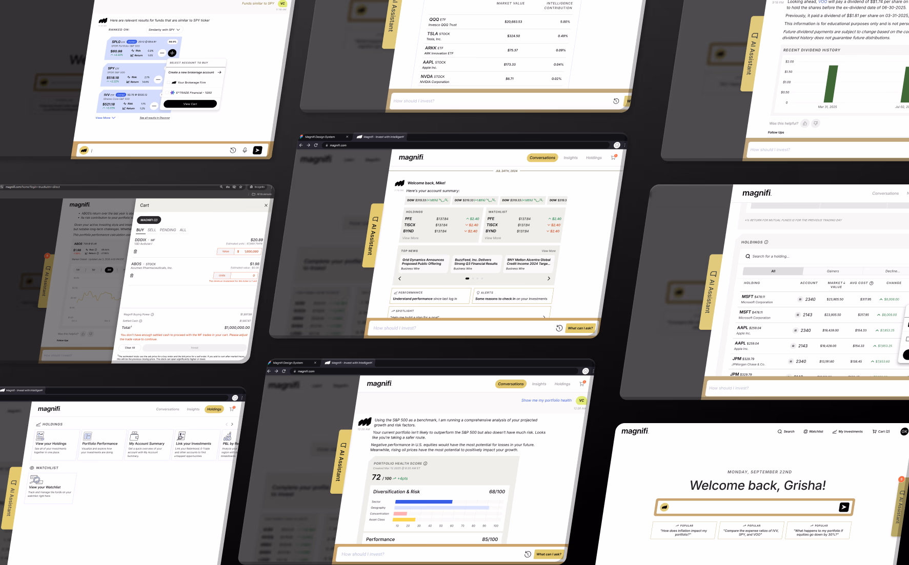
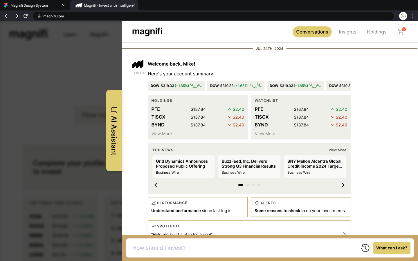
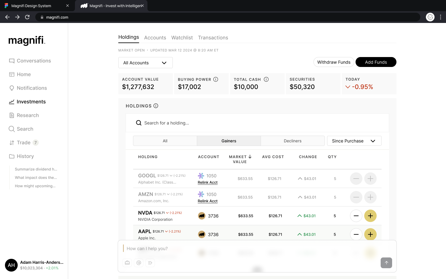
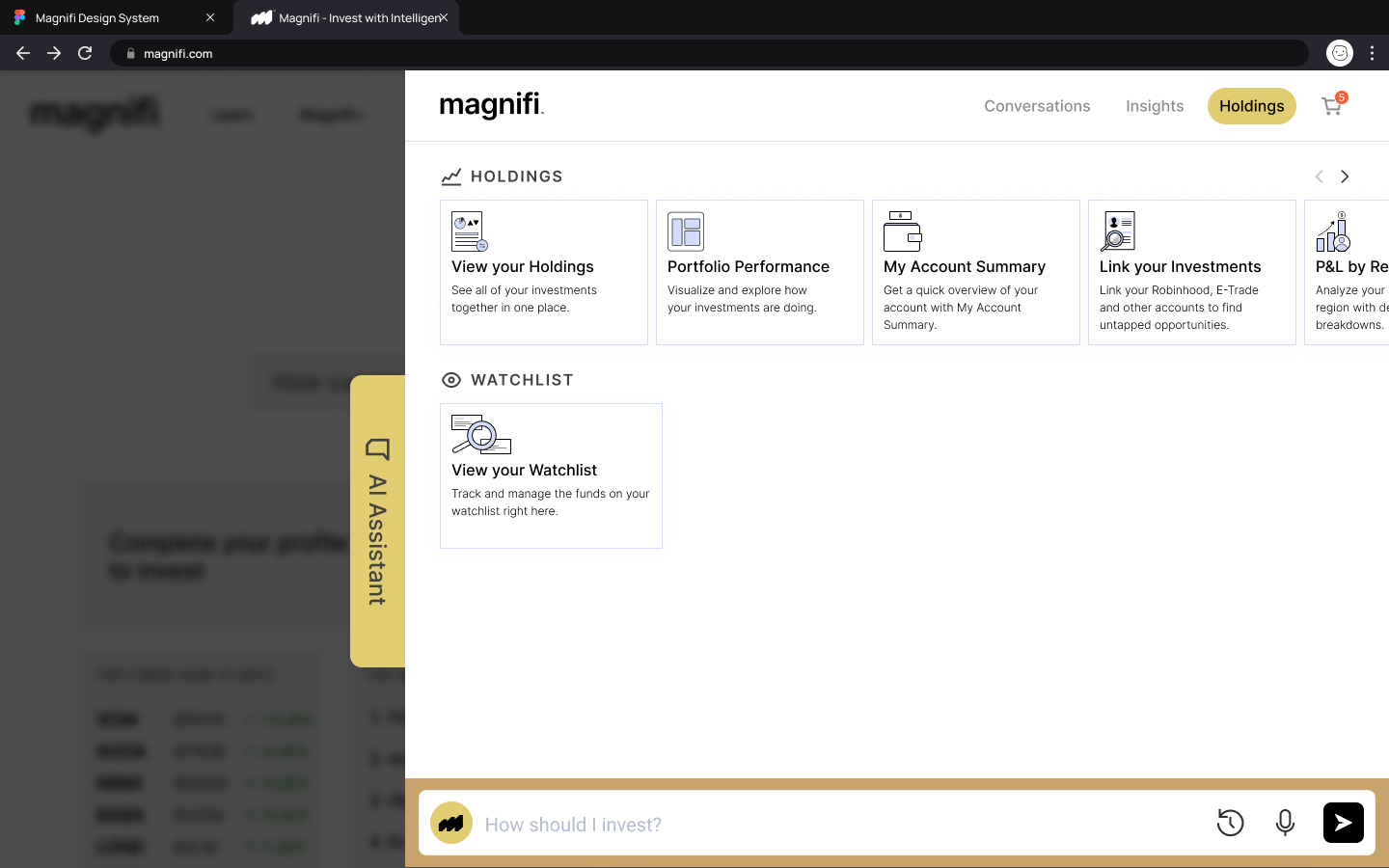
Previously, users had to click preset prompts and navigate screens to generate chat responses. The new UI surfaces relevant portfolio information and market movement directly, allowing users to understand results immediately and engage more naturally without needing to trigger outputs.
 Before
After
Before
After
Challenge 3
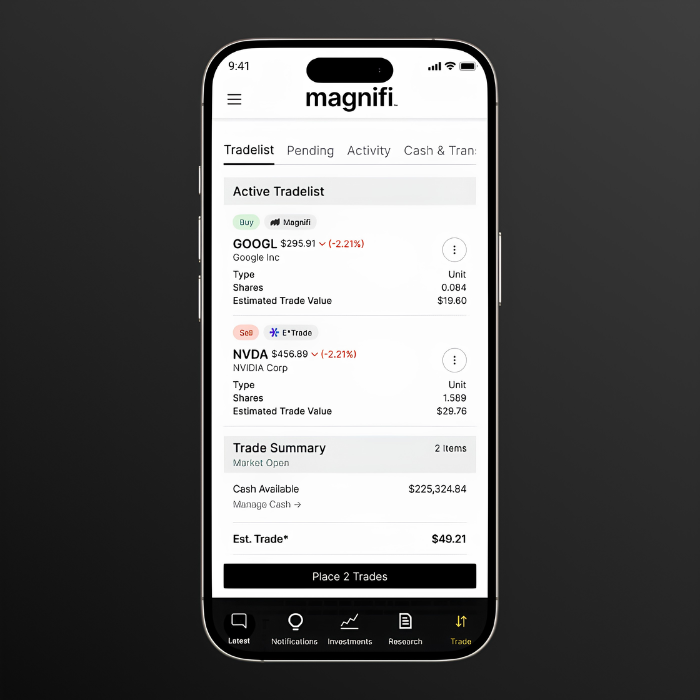
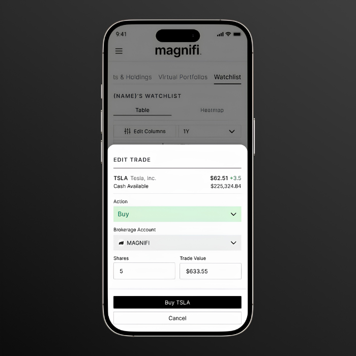
Reducing friction during trade
The earlier trade flow fragmented a single decision across multiple steps. Quantity, account selection, and validation lived in different places, and users only learned whether a trade worked after reaching the cart. Even simple actions felt interruptive and slow.
The redesigned widget brings the entire trade into one focused surface. Buy/sell, quantity, value, and account selection are handled together with real-time context like cash availability and price movement. Inline validation reduces friction, making trading faster and more predictable.
Challenge 4
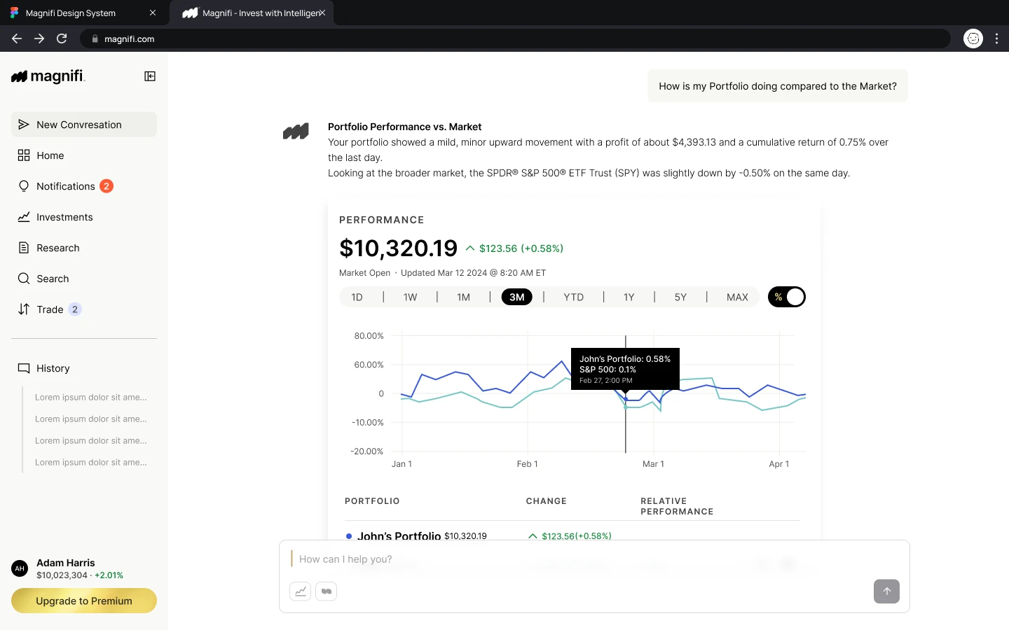
Helping investors compare performance
A user can simply type in a prompt and Magnifi will pull up a live comparison against the S&P 500, complete with a side by side chart, daily change indicators, and time range controls so users can see exactly where they stand
Challenge 5
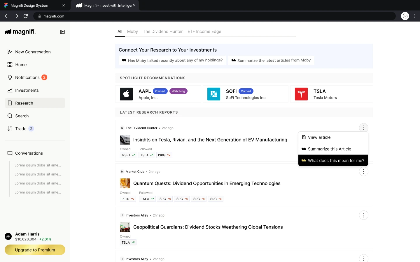
Connecting research to decisions
Staying on top of market research shouldn't feel like a second job. The Research tab connects the latest reports directly to what users already own and follow, so every article feels relevant rather than noise. Users can ask "What does this mean for me?" on any report and Magnifi instantly ties the insight back to their portfolio, making it easy to go from reading to acting.
Challenge 6
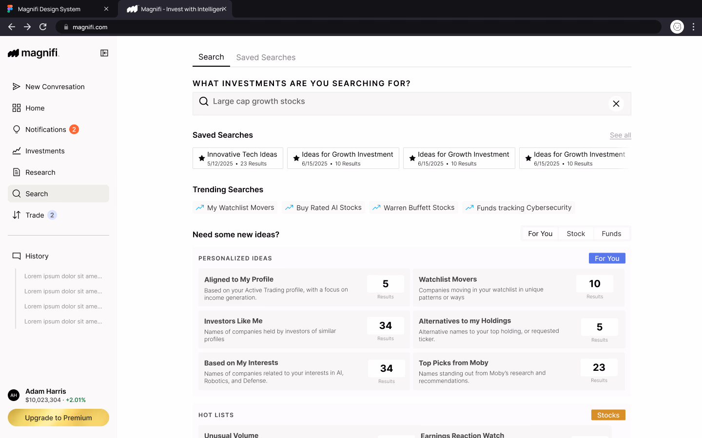
Supporting discovery
Knowing what to invest in is often the hardest part. Search goes beyond a basic lookup by surfacing personalized picks, trending ideas, and saved searches, helping users discover opportunities that actually match their profile and interests without having to start from scratch every time.
Challenge 7
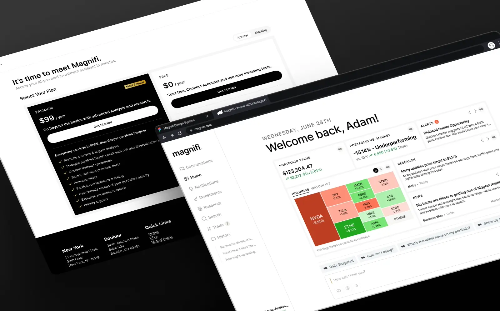
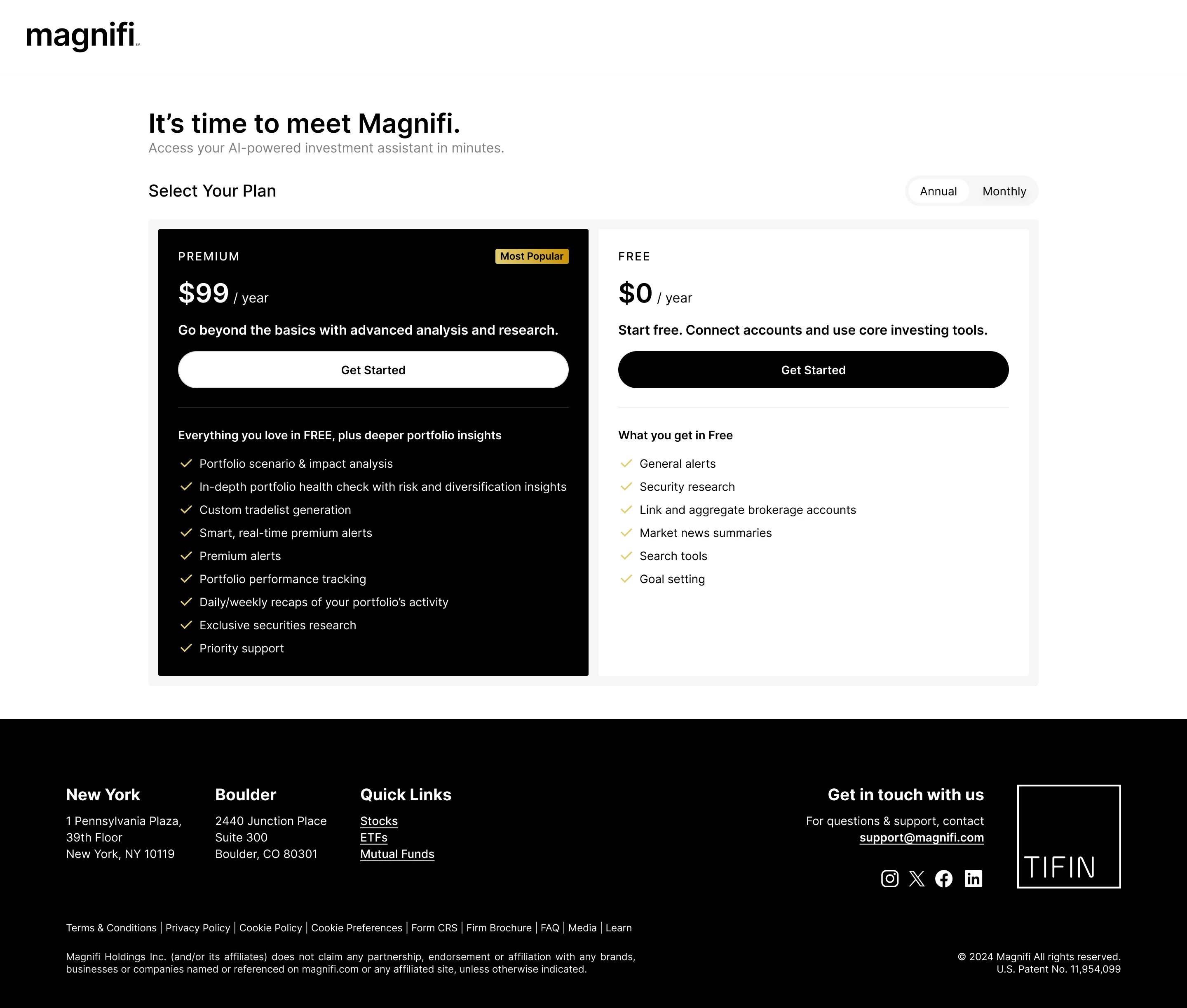
Supporting a freemium business model
As Magnifi evolved, the product team aligned on a new business direction: transitioning to a freemium model to increase acquisition, encourage activation, and create a clearer path to paid value.
The goal was to create a model that felt encouraging to upgrades through demonstrated value rather than blocking key functionality prematurely.
Reflections
What I learned
Many of the strongest improvements came from deciding what users should see first, what could wait, and where additional context would help them make better decisions.
The project also reinforced the importance of system thinking. Building shared patterns early made it easier to scale the product while keeping the experience consistent.